Data visualisation is a process that fosters new innovation and discovery through the graphical representation of data. It revolves around presenting data in a manner that makes it easier for one’s audience to understand and dissect.
This data science discipline is known to aid in decision support and help enterprises control their data in an effective manner and convert it into actionable knowledge. However, many individuals and business entities still do not know how to effectively exploit it.
What is data visualisation?
Also known as information visualisation, data visualisation is a branch of data analytics. It is concerned with the design, development, and application of visual/graphical representations of data in order to understand it better.
Fundamentally, by highlighting the most useful insights from a dataset, data visualisation makes it easier to spot trends, patterns, outliers, and relationships. It utilises visual elements like charts, graphs, and maps through the use of various tools.
Generally, it is much easier to understand data in visual form rather than in the form of numbers, texts, and large tables with a substantial number of rows and columns.
There are two main categories of data visualisation: exploratory and explanatory.
Exploratory data visualisation is used at the initial stages of data analysis to summarise the available data and analyze it visually to easily identify patterns, trends, relationships or even outliers and hence this approach works best at the point of hypothesis testing or doing diagnostics.
Explanatory data visualisation is used to communicate the conclusions of the data analysis, the visuals are presented in a particular order to tell a story, and ultimate outcome is to enable the audience to make effective decisions or take appropriate action.
Why is data visualisation important?
Data visualisation helps people see, interact with, and better understand data. Whether simple or complex, the right visualisation can bring everyone on the same page, regardless of their level of expertise.
In addition, it helps to identify correlations and anomalies that might not be immediately apparent in raw data, making it an effective tool for analysis.
Discover how organizations can make informed decisions by leveraging visual analytics as an integral part of effective data visualization strategies.
Common types of data visualisation
Following are some common charts used for visual representation of data:
Bar charts
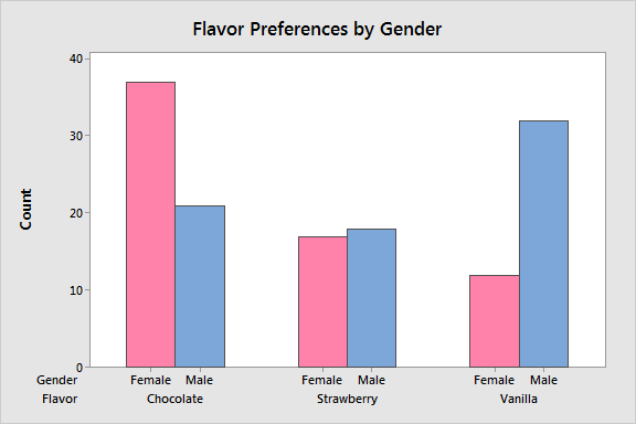
Bar charts are used to compare values across different categories, to show ranking or to show the distribution of data for a particular variable. They are represented by rectangular bars, with the length of each bar proportional to the value it represents.

source: https://statisticsbyjim.com/
Both nominal and ordinal data can be displayed using bar charts. Furthermore, they are commonly used for comparing counts or frequencies. Bar charts can be arranged horizontally or vertically, and may also be presented in a stacked format to show the composition of each bar.
Line Charts
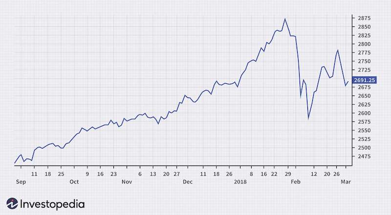
Line charts are used to display the relationship between two continuous variables on an x and y-axis. They utilise use a series of points connected by a line to show changes in data values over time or other continuous intervals.

source: Investopedia
They are especially useful for identifying patterns and trends and also for making comparisons between different sets of data. As an example, line charts can be used to depict changes in stock prices over time.
Scatter plots
Scatter plots display the values of two different variables as points. They are particularly effective in analysing the association between data and identifying correlations, patterns and deviations from the norm.

source: chartexpo
Pie charts
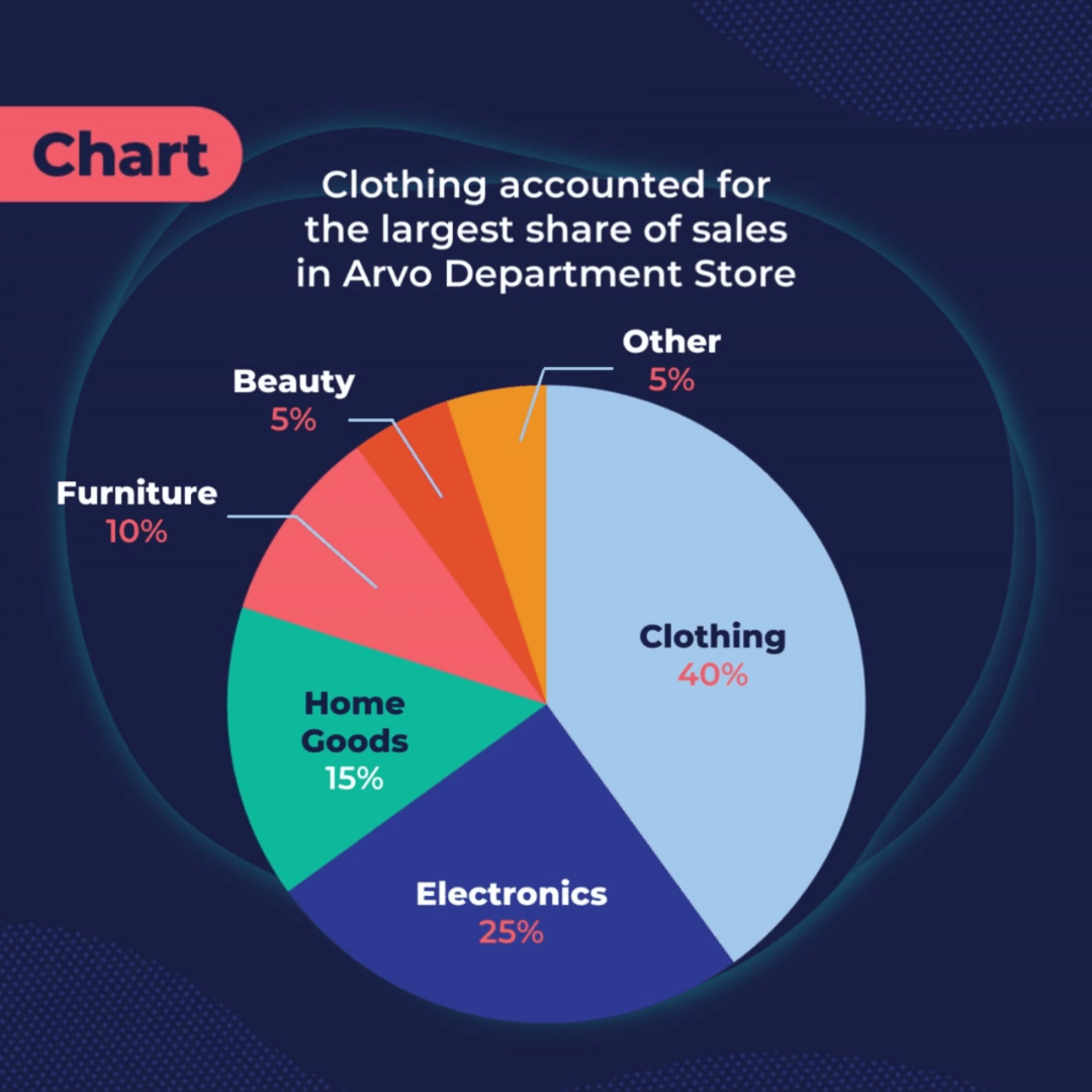
Pie charts are circular graphs used to represent the proportions of different parts of a whole. They are divided into slices, with each slice being proportional in size to the value it represents.

Pie charts are a good choice for showing the relationship between parts and the whole. However, they are difficult to interpret when the number of categories is large, or when the differences between the sizes of the slices are small.
Doughnut charts, which are similar to pie charts (but with a hole in the centre), can also be used to show proportion.
Geographic maps
Geographic maps, also known simply as maps or geographic visualisations, are a type of data visualisation used to represent data on a map or globe. They display geographic data, such as location, in the form of addresses or coordinates.

Geographic maps visualise a wide range of data, such as demographic data, crime statistics, sales data, or environmental data which can be represented in various forms. These include choropleth maps, symbol maps, heat maps, and dot density maps, among others. They are commonly used in fields such as geography, GIS, marketing, and real estate.
Advantages and disadvantages of data visualisation
Advantages of data visualisation:
- Enhanced understanding: Visual representations of data make it easier for people to understand complex information and patterns.
- Better engagement: Data visualisations are often more engaging and interactive than traditional text or tables, making it easier to retain the audience’s attention.
- Faster insights: It allows for quick identification of trends, outliers, and patterns, leading to faster insights.
- Wider reach: It can be used to communicate data and insights to a broader audience, regardless of their technical knowledge.
- Great for data exploration: Visualisation can be used for exploratory data analysis, helping to uncover relationships and patterns that may not be immediately obvious.
Disadvantages of data visualisation:
- Limited complexity: Data visualisations have limitations in terms of the complexity of the data they can represent.
- Susceptible to bias: The choice of visualisation type, colours, and scales can influence how the data is perceived and interpreted.
- Limited accuracy: Visualisations can be misleading if they are not carefully constructed and verified.
- Skill intensive: Creating effective data visualisations requires technical skills and knowledge of appropriate tools.
- Data overload: When too much data is displayed in a single visualisation, it can become cluttered and difficult to interpret.
Data visualisation steps
Identify your audience
Understanding the intended audience will inform the choice of visualisation type, the level of detail included, and the language and terminology used. Some factors to consider when identifying your audience include expertise, interest, motivation, and preferences.
Frame a message
A clear message makes for a visualisation process that is more focused and effective in achieving the desired outcome. The message will guide the choice of visualisation type, the data that is included, and the insight that is being communicated.
Choose the right visuals
The choice of visualisation type should be influenced by the message of the visualisation, the data being visualised, and the intended audience.
The type of data, distribution of the data, the data relationships, and accessibility of the data also ought to inform the visualisation type used.
Develop a story
A good story can help to engage the audience and make the insights derived from the data more accessible and understandable. Some key elements to consider when developing a story include; the introduction, the data, an analysis of the data, a conclusion and a call to action.
With a compelling story around the data and its insights, the data visualisation can be more effective in achieving its purpose and communicating its message to the intended audience.
Keep your visualisations inclusive with relevant elements
It is important that the visualisations are accessible and understandable to all members of the intended audience, regardless of their background or abilities.
Some key elements to consider when making visualisations inclusive include colour, labels, and annotations.
Provide context
Context ensures that the audience has the information they need to understand the data and the insights being presented.
Important elements to consider when providing context include; the source of the data, the time period covered by the data, units of measurement, data limitations, comparison with industry benchmarks, and background information.
Label and review the visuals
Label the visuals to effectively communicate the insights from the data. It is crucial that the labels are accurate, clear, consistent and relevant. Feedback from stakeholders and subject matter experts is also important for this process.
Data visualisation tools
We live in a great time for data analysis as a whole and data visualisation is no exception. A plethora of tools exist to make life easier for analysts.
- Tableau: This is a powerful and versatile data visualisation tool that allows users to create interactive dashboards and visualisations from a wide range of data sources. It is easily one of the most popular.
- Microsoft Excel: More powerful than most people think, Excel is much more than just a spreadsheet tool. It possesses data visualisation capabilities, such as bar charts, line charts, and scatter plots.
- Google Sheets: Just like Excel, this unassuming cloud-based tool possesses data visualisation capabilities like bar charts and line charts.
- Matplotlib: An open-source data visualisation library for Python, this tool is used to create static, animated, and interactive visualisations too.
- ggplot2: This visualisation library is built for R and is used to create high-quality data visualisations.
- D3.js: This is an open-source JavaScript library for creating front-end dynamic and interactive visualisations in web browsers.
- Power BI: Also one of the most popular tools on this list, this business intelligence and data visualisation is used to create interactive dashboards and visualisations from a wide range of data sources.
Data visualisation examples
Hans Rosling’s Gapminder World: This is a famous data visualisation that uses animated bubble charts to show the relationship between economic development and health across countries over time.
New York Times’ “Snow Fall”: An interactive multimedia feature uses data visualisation to tell the story of an avalanche in the Cascade Mountains in Washington State.
Conclusion
In conclusion, data visualisation enables companies to create valuable and distinctive understandings from their data. Consequently, businesses can forecast the upcoming days and figure out solutions to issues before they arise.
The need to deeply understand data will just become more prevalent as time progresses, so it is essential that businesses can take full advantage of their data quickly.
Sign up for a data visualisation and storytelling course at Accord Training and learn how to analyse your organisational data for better insights.
Reviewed by

Areas of expertise: Training and consulting in technology, strategy, analytics, business management, and learning and development.
Awards: ‘Innovation for Impact Award’ 2016-17 | ‘Associate Excellence Award’ 2018-19 | ‘Innovation for Impact Award’ 2020-21 by CSC.
Comments are closed.

